
When it comes to picking out the perfect wedding invitations, it is easy to get overwhelmed in all of the design decisions you have to make. Do you go traditional? Or modern? Do you go for a letterpress printing style, or is there room in the budget to add in a bit of luxe foil?
One of our biggest pieces of advice for couples to help them navigate these questions is to think about what they want to communicate about their big day. Your invitations are an opportunity to get your guests excited about your wedding — so thinking about the type of emotion you want to invoke, and what design details you want to preview, can help immensely when it comes to choosing a design that feels right for you.
And color plays a huge role in the overall impression your wedding invitation will leave on your guests — which is why couples (and wedding planners!) spend so much time picking out the perfect color palette. In some cases, these palettes lean on the couples favorite colors as a starting point. In others, the venue location, wedding date, and reception theme (rustic, beach, vintage, boho, etc.) can steer the decision-making.
Whether you have your color palette picked out, or are still unsure about what direction to go, this article will provide you with plenty of ideas for how to leverage color in your wedding invitations. Prepare to get inspired.
Minted x BRIDES Color of the Year: Marseille Bleu
This beautiful cerulean shade of blue is the inaugural Minted x BRIDES Color of the year, and is one both the editorial team at BRIDES and our designers have seen cropping up more and more as we move into the 2024 wedding season. Simultaneously energetic and sophisticated, the vibrant, rich blue is surprisingly versatile (which is one of the reasons why it earned our top spot for 2024!) and plays nicely with a whole host of color palettes and wedding themes.

Marseille Bleu Color Schemes
- Marseille Bleu + Cream. This color palette is perfect for couples whose taste leans towards the traditional, and works well for weddings that will have an antique flair.
- Marseille Bleu + Lemon Yellow + Leafy Green. Bringing to mind sparkling summers spent on the Riviera, this palette is perfect for European destination weddings (or those that are trying to recreate that feel!)
- Marseille Bleu + Dusty Pink. This paring brings out the softer side of the bold shade. Layer in terracotta and greens for a wildflower-inspired look, or add in one additional dark accent color for a romantic-meets-moody vibe.
- Marseille Bleu + Charcoal. This combination is perfect for couples that are looking to add a bit of drama to their day, while still staying true to their minimalist aesthetic.


Themes where Marseille Bleu Invitations Might Make Sense
- Riviera-inspired. Because it calls to mind beautiful the toile de Jouy and chinoiserie prints so often found in villas that dot the Riviera — not to mention the stunning water of the Riviera itself — Marseille Bleu is a beautiful invitation color if you’re hosting a wedding inspired by the destination.
- Summer. Marseille Bleu embodies the spirit of hot summer nights, and, when paired with equally bold colors on an invitation, is perfect for high-energy summertime weddings.
- City Weddings. Lean into the shade’s sophisticated side by opting for an invitation that features accents of Marseille Bleu and letterpress details for chic city nuptials.


Blue
Though we’ve pegged the specific shade of Marseille Bleu as our color of the year for 2024, the truth is that blue wedding invitations will never go out of style. Associated with serenity and tradition (hello, “something blue!”), there’s a shade of blue that is fit for nearly every wedding.

Other Trending Blue Shades for 2024
- Navy. Deep and sophisticated, this shade is every bit as versatile as black, without being quite so harsh.
- Robin’s Egg. The vibrant, green-blue shade is always a winner for spring and summer weddings.
- Powder Blue. One of the most versatile shades of blue, powder blue is a bit of a chameleon, serving as a neutral in more bold color schemes or standing on its own in softer palettes.


Blue Color Schemes
- Navy + White or Cream. You can never go wrong with a blue and white color scheme on your invitation. Going for a darker shade can give the simple color palette a slightly more formal feel.
- Powder Blue + Robin’s Egg + Navy. Combining all of this year’s trending blue shades creates an aquatic-inspired palette perfect for invitations that lean into a beachy or ocean theme.
- Blue + Green + White. If you’re looking for a traditional take on a botanical themed wedding invitation, go for this color palette. There is lots of room to play with the exact shades here — softer blues and greens are beautiful for spring, while richer tones are great for more traditional weddings.


Themes where Blue Invitations Might Make Sense
- Winter Weddings. We often associate blue with cold and ice, so carry a winter theme forward with dramatic blue wedding invitations.
- Beach/Lake Weddings. The color blue comes to mind when thinking about ocean waves or lake tides lapping against the shore, making it an ideal color selection for beach wedding invitations.
- Modern Formal Weddings. Instead of the classic black and white formal wedding invitation, add a modern twist and opt for a navy and white theme.
- Rooftop Weddings. If your wedding celebration will involve some stargazing, bring that romance and elegance into your wedding invitation colors with navy blue cardstock accented by gold or silver foil press elements.


Black
The epitome of sophistication and class, black is usually associated with elegance and authority. Black is the darkest color and with it brings a mood of mystery, sensuality, and formality that explains why the “little black dress” and black tie events are so alluring. Black makes for an obvious accent color for most invitation styles, but don’t be afraid to use it as your primary shade!

Black Color Schemes
- Black + Metallic Foil. Bring the drama! This is the perfect color palette for a wedding that is leaning into all kinds of opulence and glam. Look for an invitation that uses black a background color against which gold, silver, or even rose-gold foil accents can really pop.
- Black + Sage Green. For an unexpected take on a botanical wedding invitation, go for a style that contrasts soft organic green tones with a black background.
- Black + White. Does it get more classic than this? A white invitation printed with black letterpress text on luxe cardstock will always be a winning combination. But, for something more modern, look for a style that reverses the roles by using black as the background color and white for the typography.


Themes where Black Invitations Might Make Sense
- Black Tie Weddings. Black plays an integral role in this formal type of wedding. Honor this theme in your wedding invitation colors, too, with clean black text and accents.
- Gothic Weddings. Black is a large part of the dark and moody color palette in these opulent, mysterious weddings. If you’ve secured a castle venue, you may want to explore how dark tones can add to the historic vibe.
- New Year’s Weddings. If you and your partner are planning to tie the knot around January 1st, you may be inspired by the more traditional New Year’s celebration color palette of black and silver.
- Art Deco Weddings. When you think of flapper dresses and Great Gatsby-inspired celebrations, the color black always comes to mind. An art-deco-themed invite with geometric rose gold foil accents will hammer this theme home.


Purple
Often associated with royalty, luxury, and power, purple represents wealth and extravagance. The color purple rarely occurs in nature, and because of this, it is seen as coveted and sacred. Visually, it is an uplifting color that sparks the imagination, a sense of magic, and new levels of creativity, making it perfect for weddings that embrace creativity at every turn.

Trending Shades of Purple for 2024
- Hazy Lilac. This moody, muted shade of purple is one of Benjamin Moore’s colors of the year for 2024 — and it’s no surprise that it has already made the leap from interior decor to wedding decor thanks to its ability to slot into a wide variety of color palettes and aesthetics.
- Lavender. This bright, cheerful shade is perfect for spring and summer weddings and pairs as well with pastels and neutrals as it does with punchier, wildflower-inspired hues.
- Burgundy. Burgundy will forever be a favorite for fall and winter weddings, and is a great way to lean into the opulence of purple without going overboard.


Purple Color Schemes
- Hazy Lilac + Rich Greens + White. This muted, floral-inspired palette works well for wedding invitations no matter the season.
- Burgundy + Metallics. Play up the richness of burgundy tones with an invitation that contrasts the deep shade with super-shiny foil-pressed details. Pair burgundy with gold for a fall-inspired invitation, silver for something that feels a little magical, or rose gold for an unexpected twist.
- Burgundy + Rose + Green. Deep burgundy and rosy pink are a match made in heaven — look for a design that pairs the two shades with green for an organic feel.
- Lavender + White. Either shade can take center stage in this fresh and youthful color scheme.


Themes where Purple Invitations Might Make Sense
- Vineyard Weddings. Deep purples are often associated with wine and the crushing of grapes, so invitations in deep purple with complementing greenery are a nice nod to a vineyard setting.
- Royal-Inspired Weddings. If your wedding theme involves palace nuptials or entering via horse and carriage, dark purple wedding invitations gilded in gold foil will only add to the prestige.
- Destination Weddings. Lively tropical foliage can sometimes include memorable shades of purple. Carry a violet or lavender color theme forward as you narrow in on destination wedding invitation ideas.
- Fairytale Weddings. Whimsical themes often include light purples, so weave this fairytale look into your wedding invitations through the use of soft watercolor.


Red
Red is known as the color of extremes: passion, love, danger, and anger. Historically, its intensity has caused couples to shy away from red wedding invitations. But, in recent years, red tones like rust and cherry have become more popular across fashion, interiors, and, of course, weddings. Now, more couples than ever are taking cues from Chinese and Indian cultures — which associate red with luck, joy, and prosperity — and incorporating the color into their big day.

Trending Shades of Red for 2024
- Cherry. Rich and bright cherry red took the fashion world by storm in 2023. In 2024 the trend is poised to make its way into the wedding space in the form of decor, bright-red florals, and of course, invitations.
- Wine. Deep wine tones are a great option for couples that like the idea of red, but don’t want to go overly vibrant with their color palette.
- Rust. Burnt, rusty shades of red have always been a go-to color to incorporate into fall weddings, but they’re also great for rustic and barn-themed celebrations.


Red Color Schemes
- Rust + Coral + Green. While rusty red is most commonly associated with rustic weddings, when paired with punchy coral and vibrant green, the shade is perfect for tropical destination wedding invitations.
- Red + Gold. Chinese wedding invitations traditionally pair vibrant, candy-apple red with gold foil to communicate the prosperity of the marriage. This pairing also works well with wine tones for a more muted, but no less luxe, look.
- Red + Green + Cream. A botanical print in rich greens and reds is a beautiful, subtle nod to classic colors of the season when paired with cream or white for a holiday wedding.
- Rust + Wine + Yellow. Lean into the beautiful shades of fall with a wedding invitation that features a color palette of rust, wine, and rich yellow.


Themes where Red Invitations Might Make Sense
- Holiday Weddings. If you’re planning a December wedding that will incorporate a Christmas tree, holiday wreaths, and pinecones, invites with red berries and holiday branches are a natural tie-in.
- Rustic Weddings. Burnt reds come to mind when thinking about a barn wedding that features an old tractor parked out front, which makes it the perfect shade to incorporate as an accent color in invitations for a rustic wedding.
- Fall Weddings. The changing color of autumn leaves usually involves countless shades or red, orange, and gold. Weave these colors into the decor and stationery used to celebrate your fall wedding.
- Chinese Weddings. Red is the most popular color in China and symbolizes luck, joy, and happiness. Perhaps one or both members of the wedding couple want to pay homage to their Chinese culture and roots by featuring the auspicious color throughout their wedding stationery.


Silver or Gold
Out of all the colors on this list, silver and gold are most often thought as accents when it comes to wedding planning — but they don’t have to be! Both colors are steeped in tradition and symbolism. Silver is most often associated with elegance, sophistication, and modernity — it is also thought to be a mirror to the soul, helping us see ourselves as others do, making it very fitting for a wedding celebration. Gold, on the other hand, is associated with luxury, good fortune, royalty, and spiritual power, and many cultures have a deep tradition of exchanging gold on wedding days to mark the prosperous start to a marriage.
Silver Color Schemes
- Silver + Stone. To play up the natural beauty of silver, go for an invitation that features it as an accent to a background in a light gray or dusty cream.
- Silver + Navy. Navy’s natural cool tone means that silver is its perfect complement. A navy and silver invitation is perfect for city weddings with a modern, luxe vibe.
- Silver + Pastels. For a fresh take on silver, look for an invitation that pairs silver foil unexpectedly with pastel blues, purples, and even corals.


Gold Color Schemes
- Gold + Black. For couples looking to balance boldness and tradition, a black and gold invitation will never go out of style. Tailor it to your taste by looking for designs that use gold foil in interesting ways, such as to create an intricate pattern or to accent playful typography.
- Gold + White. Gilding an invitation printed on white cardstock is a timeless way to communicate luxury and tradition.
- Gold + Wildflower Tones. Give an invitation that features a palette inspired by a wild bouquet of wildflowers a luxe upgrade with gold foil accents. This palette is surprisingly versatile — it can lean vintage or modern, depending on the illustration style it is paired with.


Themes where Silver or Gold Invitations Might Make Sense
- Ballroom Weddings. If your wedding celebration is an extravagant ballroom affair, bring that elegance into your wedding invitations with designs that include dramatic silver or gold foil elements.
- Garden Weddings. Juxtaposing colorful flowers with reflective gold or silver is a beautiful way to combine organic and glamorous aesthetics. There are plenty of beautiful wedding invitation designs that combine the two into miniature works of art, and you can further build on this theme with silver flower vases for your centerpieces or gold napkin rings at each place setting.
- Winter Wonderland Weddings. We often associate silver with snowflakes and ice, so carry that theme forward with beautiful silver mountain wedding invitations.


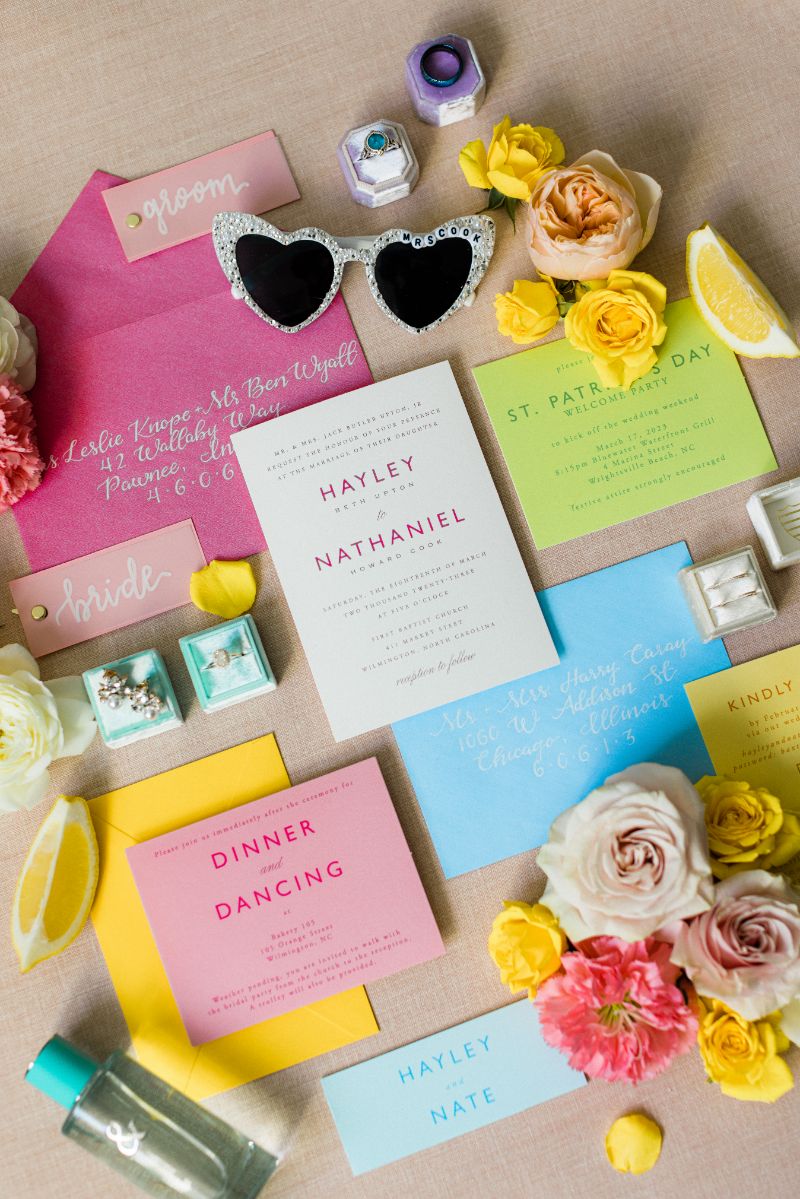
Pink
Universally, pink is recognized as a color of love, friendship, and affection. Pink can also be associated with flowers, whimsy, and a general air of playfulness. A great color for a spring affair, you will have choices galore for wedding flowers in different shades of pink, red, and white.

Popular Shades of Pink for 2024
- Dusty Mauve. A desaturated mauve is a beautiful way to lean into the more mysterious side of pink, making it perfect to incorporate without coming off too feminine.
- Ballet-Slipper. Light, baby pink is a classic — and with the continuation of the balletcore trend, is a color that is only getting more popular.
- Magenta. On the opposite end of the pink spectrum, couples have embraced hot pink and magenta as a fun and punchy accent color for both wedding decor and their invitations.


Pink Color Schemes
- Pink + Black. Both ballet-slipper pink and dusty mauve look great when paired with black. To keep a romantic vibe, look for invitations that keep pink as the predominant color or, play with contrasts by finding a design that incorporates equal amounts of the two hues.
- Ballet Pink + Copper. For a fresh twist on a foil-pressed invitation, forgo classic gold or silver for a warm, rich copper. The color is deep enough to provide a nice contrast to the lighter pink shade, while still being within the same color family for a chic tonal look.
- Magenta + Green. This color palette takes its inspiration from rich magenta flowers like bougainvillea, dahlias, and camille pisarro roses. Pair it with creamy background colors and lighter pinks for a softer look to your invitations, or go saturated with vivid greens and bright whites for a tropical look.


Themes where Pink Invitations Might Make Sense
- Poolside Weddings. We often associate bright pink with flamingo pool floaties and days by the pool sipping tropical drinks through fluorescent pink straws — or, on the more glamorous end of the spectrum, with the iconic pink and green palette of the pool at the Beverly Hills Hotel. Bring that playful color and look into your wedding invitation selection.
- Backyard Weddings. Lush pinks and shades of fuchsia come to mind when imagining backyard rose gardens or full floral centerpieces, making it an ideal color choice for a backyard wedding invite.
- Bohemian Weddings. A wide range of pinks are often used in boho chic wedding decor, so it seems only natural to pull that color palette over into your wedding signage and stationery as well.
- Easter/Spring Weddings. It might seem cliche to feature pastel colors during an early spring wedding, but it is a classic for a reason. Make it more modern by pairing softer pinks with unexpected pops of saturated colors like Marsielle Bleu or magenta.


White
White is the color of innocence, representing purity and new beginnings — which is why it has become such a popular and traditional wedding dress color in Western cultures. As a color, white also conveys cleanliness, freshness, and simplicity. Because it is the lightest color and very easy on the eyes, it is the go-to option across a wide range of wedding aesthetics and styles. Make your stationery noteworthy by opting for a luxurious letterpress invitation suite.

White Color Schemes
- White + Black. You really can’t go wrong with this color scheme — just be sure to lean on details like letterpressed text and luxe cardstock to make invitations in this paired-back palette feel special.
- White + Cream + Green. It feels counterintuitive to combine white and cream, but when put together in an invitation design that calls to mind the beauty of creamy white flowers like magnolias or roses in all their complexity, it can be beautiful.
- White + Metallics. If you love the look of a foil-pressed invitation, going for a predominantly white design can be a great option. That way, the beautiful gilt of the foil color you choose will really pop — especially if you go for a color that is slightly deeper, like gold or copper.


Themes where White Invitations Might Make Sense
- Simple/Micro Weddings. For the couple that isn’t looking to max out their wedding budget and aiming to keep the guest count relatively small and intimate, a simpler white invitation might help carry that desire across to invited guests.
- White Tie Weddings. A white tie wedding is even more formal than black tie weddings, and is often synonymous with luxury and glamor. With all the white bowties, white vests, and white waistcoats, it only seems fitting to feature pristine white wedding stationery.
- Traditional/Religious Weddings. Let’s face it, certain colors are much flashier than others. If you are looking to stick to traditions or focus more on the religious significance of matrimony, you may want to feature a more conservative invite with the attention being placed on detailed calligraphy as opposed to decorative or colorful design elements.


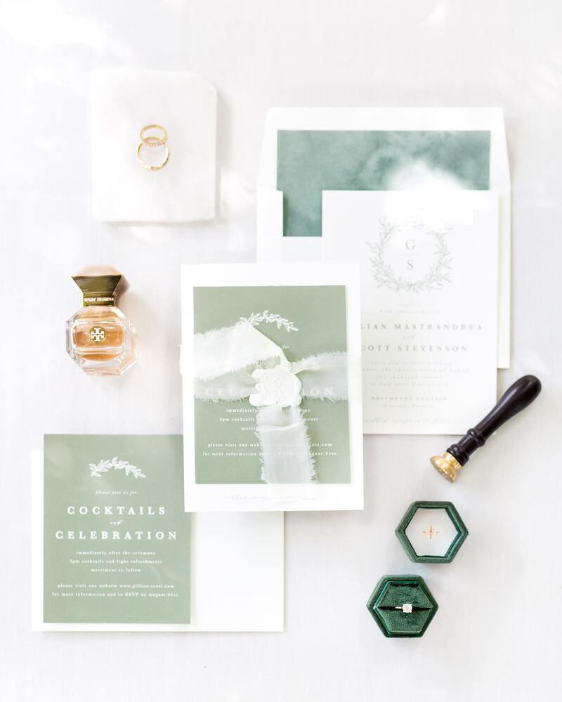
Green
The embodiment of nature, renewal, and life itself, green can be a beautiful color to incorporate into your wedding. Depending on the shade, green can almost serve as a neutral, or it can be bold and punchy. Either way, it is known to have a relaxing and harmonizing effect — which sounds like just the right atmosphere for a reunion of your closest friends and family.

Peaks by Sarah Brown
Popular Shades of Green for 2024
- Sage. Lighter shades of green like sage have taken the wedding industry by storm, showing up everywhere from bridesmaids dresses and bouquets to invitations.
- Emerald. Rich and luxurious, emerald green is a timeless shade of green that is perfect for winter weddings or more formal affairs.
- Pistachio. This playful shade is one that we see couples incorporating more and more into their weddings, and makes for a fun, unexpected pop of color in decor and stationery.


Green Color Schemes
- Emerald Green + Gold. Emerald green and gold can come together to match a huge range of styles and wedding themes including traditional, glamorous, and even tropical destination weddings.
- Sage + White + Pink. If you love the look of soft, muted florals, this palette is for you. Look for a design that pairs a white background with painterly illustrations of flowers featuring various sage tones and dusty pinks.
- Pistachio + White. This color combination is perfect for couples that want their invitation to make a statement, but are minimalists at heart. A pistachio background really allows white typography to take center stage in a way that feels fresh and modern.
- Sage + Blue. Draw from the colors of the earth and the sky with this color palette. We love it in invitation designs that take inspiration from landscape paintings, making it the perfect choice for a countryside wedding.


Themes where Green Invitations Might Make Sense
- Forest Weddings. Dark green is naturally associated with the woods. Build excitement around your outdoorsy wedding venue sheltered beneath giant redwoods or set amongst an aspen grove by using it for your first wedding correspondence to your guests.
- Tropical Weddings. Palm fronds and giant monstera leaves are emblematic of an ideal tropical oasis. Get guests ready to travel to your tropical beach wedding with invites depicting the lush green plants.
- Greenhouse/Botanical Garden Weddings. If green is going to be one of the predominant colors at your wedding — as it will be if you’re getting married in a lush botanical garden or greenhouse — then use it as a neutral in your wedding invitations! Pair it with the other colors you plan to highlight in your decor or bouquet throughout the day for an invitation that feels uniquely you.


No matter what wedding invitation idea and color scheme you have floating around in your mind, know that Minted has a unique design to match your vision. All of our invitation designs come in multiple colorways hand-picked by the independent designer who created them, and are also available to be customized — meaning that you can find a shade that perfectly aligns with your wedding color palette.
If you can’t find a design that feels 100% you, you can work with our design services team to create a custom look from scratch based on your direction.