Wedding planners, take note: Practice these techniques at home to beautifully elevate your portfolio and photo shoots with minimal investment.

Not only does the wedding invitation provide important wedding-day details, it‘s also a preview into the couple‘s wedding aesthetic and gets guests excited for the celebration to come. You've already spent countless hours poring over design boards with the couple, perfecting every detail. The same thought and intention that goes into picking the perfect invitation should also go into styling the flat lay photographs.
When most people buy cards, stationery, or invitations, their focus stays on what goes inside the envelope. However, what goes on the outside is just as important. The whole experience of a letter is not complete without considering the envelope and that beautiful first impression it can have on the receiver. Envelopes from Minted can be brought to life in many ways. Whether it is through matching or coordinated free recipient addressing designs, a stunning envelope color with black or white all-script lettering, wax seals, or more, these luxe envelopes will be spotted from a mile away and make the receiver so excite to tear it open.
Minted sent me samples of their beautiful invitation suites from their new 2020 collection. Each suite below is styled two different ways to fit their own unique theme.


The "Stylist Script" suite in ivory is clean and modern, but also has a whimsical quality. I imagined this as a spring wedding at a summer camp in the woods with bright, warm colors. Diving deeper into the vision for the wedding, I decided that the couple were both entomologists who met at work—one with a love of bees and the other a passion for butterflies—so both insects would be worked into the wedding-day design. I created an inspiration board for this imaginary wedding (above), which established both the color palette and the mood for the day.
You can see how the styled invitation flat lay, placed in the center of the grid, fits seamlessly with the other images. This is the end goal when styling with intention. If you’re working with a photographer who takes the lead on styling the invitation, it’s important to share your mood board and design inspiration for the day with them so they can translate it into the image. The overall feeling of this board evokes spring, even though the invitation itself doesn’t.
When I'm styling an invitation flat lay, there are two major decisions that will affect the overall feeling of the image:
What color background am I styling on?
Am I styling the elements within traditional grid lines (where the pieces are arranged in a neat grid with the edges of the items parallel to one another) or in an organic fashion?
I chose to style this on a green background, since it would be a prominent color of the wedding day, and with traditional grid lines. The grid format establishes structure in the image and helps balance out the more loose placement of the flowers. When practicing your styling, create a detailed narrative (even if it is imaginary!) to keep in the back of your head as you work and style purposefully. Thoughtfully practicing how to style with intention allows you to easily implement the practice throughout your real weddings.
Sometimes couples select their invitations before they’ve fully decided on the colors of their day, so colors or design elements brought into the mix later in the planning process may not be present. This invitation suite features neutral colors with a whimsical font. As you can see in the mood board, the wedding design is also whimsical, but unlike the invitation, it bursts with color. If your couple decides they want to incorporate an element like bright flowers, but their stationery style is minimalistic, styling can tie it all together and start to tell the story of the day.
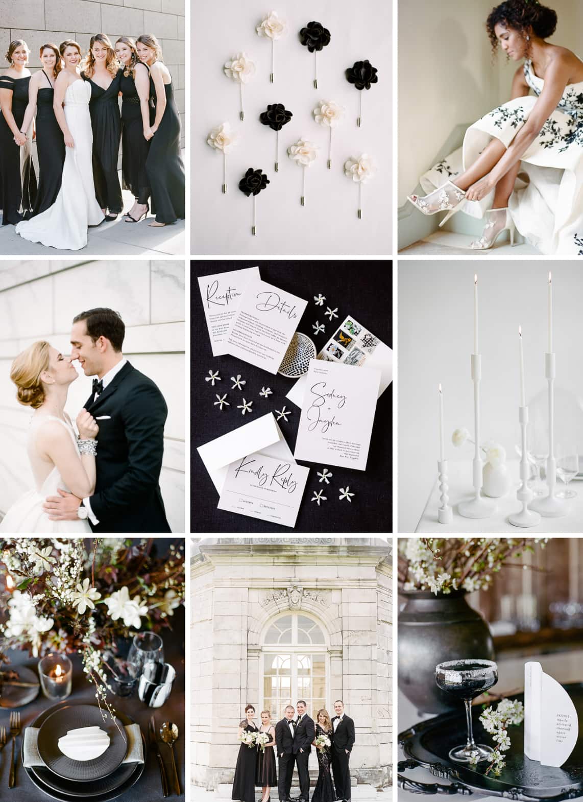
For our second scenario, I imagined this couple having a sophisticated black-tie wedding in New York City with modern black-and-white graphic details. I used a black styling surface to create a bold look and chose a more organic styling layout instead of grid lines to play with the design’s edginess and make the calligraphy feel less whimsical, which I had wanted to play up in the colorful springtime wedding flat lay. Here, I used only black-and-white styling accents, tiny jasmine flowers, and a ceramic ring dish to feel modern, minimal, and clean with a little bit of edge.


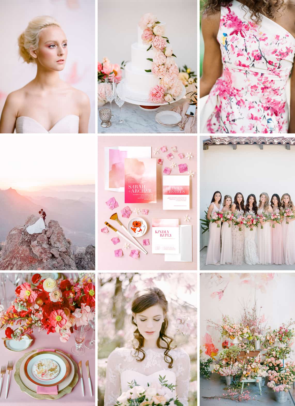
For the beautiful watercolor “Raptured” invitation suite in sorbet, I created two mood boards: I imagined the first wedding (left) to have a very feminine feel that would take place in a museum or art gallery, with many shades of pink flowers and painterly accents. The second (right) is a tropical wedding in Hawaii with oversized tropical leaves, hot-pink bougainvillea, and ocean views. Once again, the same invite works perfectly for both events, it just needs to be styled correctly to tell the wedding story.
In the painterly mood board, there are many beautiful but pricey flowers shown, like peonies and poppies. The flowers in my invitation flat lay aren’t an exact match, but the overall color and mood blends perfectly. It can be hard at real weddings to get extras of expensive blooms for the invitation styling. I always try to style with extra blooms from my clients‘ wedding day, but if it’s not possible, you can still work with different blooms to evoke the look you want as long as the flowers are in their color palette. A great tip for when you don’t have extra flowers on the wedding day itself is to style the invite the next day using a few of the blooms left over from a centerpiece or bridesmaid’s bouquet. If you don’t have access to many flower varieties locally, just work with what you've got. For this image, I took hydrangeas from my garden and individually snipped off petals and placed them around the stationery along with the jasmine. I often use this technique with other flower petals too, creating seven to eight small styling accent pieces, instead of one large flower that might draw the eye of the viewer, overwhelming the invitation in the frame.
Postage stamps can be great styling tools, as well. I included three vintage stamps here, featuring works of art in magenta and red tones, which tie in the brighter colors that I didn’t have flowers for and also reinforces the art theme, along with the paint brushes. The overall color story is so important; if these brushes had black handles they would stand out too much and pull the viewer's eye towards them since there are no other black details in the flat-lay palette, so pick your styling items carefully.
In the tropical wedding’s mood board above, I use the same strategy—using postage stamps in a dish alongside the invitation suite as a storytelling tool. When styling an invite, we want to always show it off in its best possible way. Just like we would pose a person in a flattering way, we can flatter an invitation and make it look more elevated and luxurious with the right styling. I included stamps in both of these photos, but displayed them in dishes, not affixed to the envelopes. Here, I also wanted to show off the envelope liner, which is an upgraded detail, but needed to hide the fact that I did not have an envelope with calligraphy or custom printing on the front. In instances where I do show the front of an envelope without an address on it, I will layer it strategically—like I did in the modern black-and-white wedding invitation flat lay—so you can see the stamps but can’t see that the blank envelope isn’t addressed. If your client's invitation features an envelope liner, as well as custom address printing or calligraphy, and you want to show both sides of the envelope in your image, be sure to have two copies of the envelope for styling: one with a complete front including the address and stamps and a second envelope with a clean liner that hasn’t been sealed and unsealed. Make sure you’re using new envelopes that haven’t gone through the mail, which can be bent, dirty, opened, and/or stamped by the post office.
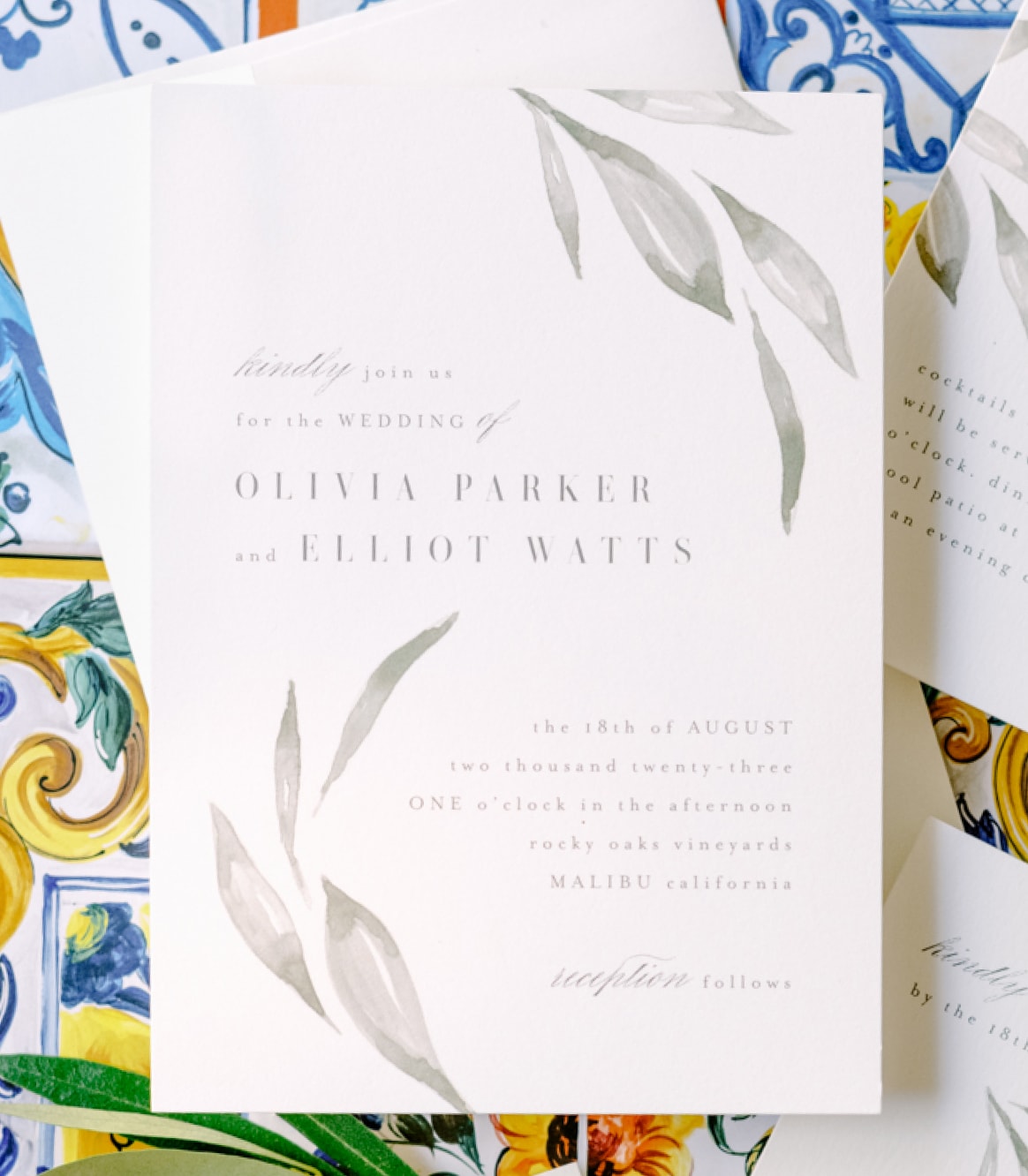
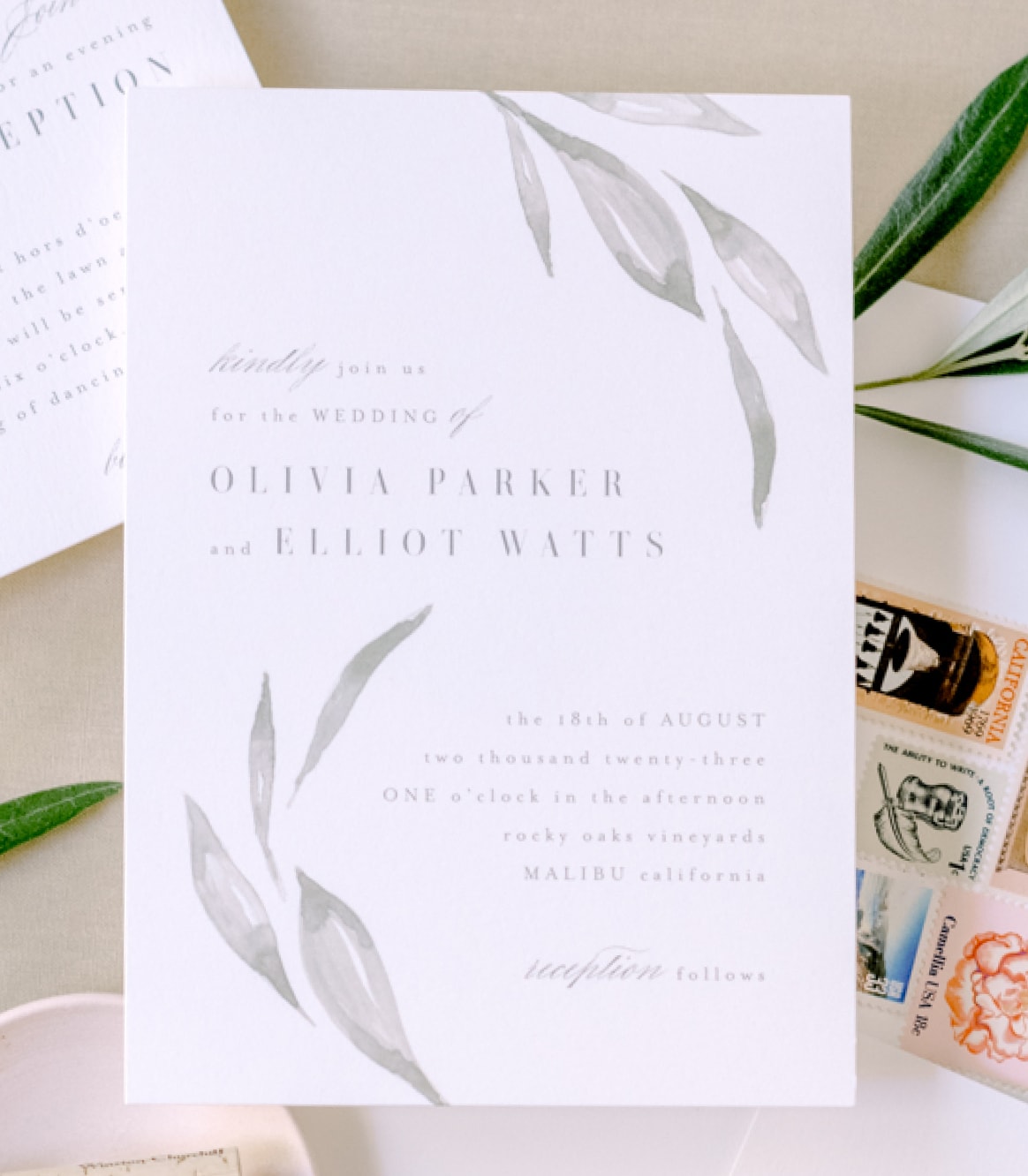
For the final invitation suite, I selected the delicately watercolored "Whispered Leaves" invitation in the leaf colorway. Olive branches are a beautiful way to incorporate greenery into a wedding design and olive trees are found in so many different places around the world that the invitation could be used for a variety of wedding aesthetics. I imagined the wedding on the left as a colorful wedding in Ravello, Italy, that takes place in an olive grove; the overall wedding look would incorporate the vibrant colors of the majolica tiles found up and down the Amalfi Coast. The second imaginary wedding takes place in wine country, in California's Napa Valley, with a soft, neutral palette incorporating beige, blush, and olive green as the dominant colors of the day.
I styled this invitation on scarf boxes that I had saved from a purchase years ago because I loved the colors and knew I could use them for something someday. When building your styling kits, you don’t have to go out and invest in a lot of expensive trinkets. I recommend investing in a few basic backdrops, a couple neutral ring boxes, and some styling dishes. Everything else I usually use, I pick up inexpensively at crafting stores, thrift shops, antique markets, and local souvenir shops; ideally, I also try to incorporate actual elements from my clients‘ wedding day. When I’m using a brightly colored background like this one, I keep the rest of the styling very minimal to not overwhelm the invitation. All I added were a few sprigs of foraged olive branches, which I often do on location on my clients' wedding day. I created a simple, organic-looking zigzag shape with the cards, which allows the eye to move through the frame in one fluid motion. This prevents the viewer from visually getting "stuck" in a dead space or being forced out of the frame before every piece of the invitation is viewed.
The thumbnail rule is a great way to troubleshoot your styling. Flat lays are all about composition, so when you shoot from above, you’re simplifying the image and focusing on the shape the forms create—which means you want to make sure they form a composition that's pleasing to the eye. Looking at your styling at full-scale through the naked eye can make it difficult to take in the entire composition. However, when you shrink it down, you can decontextualize the flat lay and really focus on the outline of the shape you’ve created and see if anything feels off. To do this while you’re working, take a photo of your flat lay on your phone and look at the image as a whole instead of the actual invitation on the styling board. Try holding your phone at an arm’s distance away from you and by doing so you’ll be shrinking it down to a much smaller thumbnail version of itself. I often do this three or four times before I perfect my flat lay and shoot it on my real camera.
For the Napa wedding, I chose to style it against a sand color backdrop to establish a neutral, warm feeling. Grey is a cool tone so it wouldn’t have worked well, and white or cream would have been too stark a contrast from the other colors in the mood board. As mentioned previously, I used stamps from California to help create a narrative to the day and layered the envelope behind the main invitation card to hide that it isn’t addressed. It is styled in an organic way, but the cards are placed in a softer, more fluid S-shape than the Amalfi version, which was modern and edgy with its zigzag shape. I added a wine-bottle cork from a local Napa winery in a blush ceramic dish to complement the colors of the flowers in the mood board, and tucked it under the corner of the main invitation card to create dimension. Our eyes love texture and dimension and we use them in all types of design work, from our wedding-day designs to architecture, interiors, painting, sculpture, photography, and beyond. It may be called a flat-lay image, but we don’t want our images to look flat, so we use risers underneath to lift the paper, creating a subtle shadow behind it which provides dimension. It also allows the paper to lie perfectly flat when we tuck things beneath, like a dish or an olive branch. If the card did not lie flat it would appear warped overhead as it would be angled towards the lens. When it comes to risers, you can use almost anything to lift the card from the surface. My go-to are rolls of washi tape, which are little rolls of Japanese paper tape, which come in various heights, diameters, and colors. You can easily stack the rolls beneath the cards to create varied heights in your image. Other great riser options are acrylic blocks and rows of staples—really, anything that lifts the cards from the surface while still lying flat.
As you prepare for your next wedding or editorial photo shoot, start thinking about the invitation flat lay well in advance so you can style it with intention. Don’t forget to use risers, consider the overall mood and color story of the day, decide between an organic or grid-lined styling layout, and use the thumbnail rule to troubleshoot your images.
For more in-depth compositional tools that will help you style your flat lays with easy, as well as a deep dive into balance, color, composition, scale, and how the eye travels through a frame, you can check out Rebecca’s Flat Lay Styling Course on her website.
Minted readers get a 15% OFF discount on any of the courses through August 1st using the code: RYPMinted15.
Our mission is to help artists thrive. Join our
community by submitting entries to our design
challenges or applying to our maker marketplace.